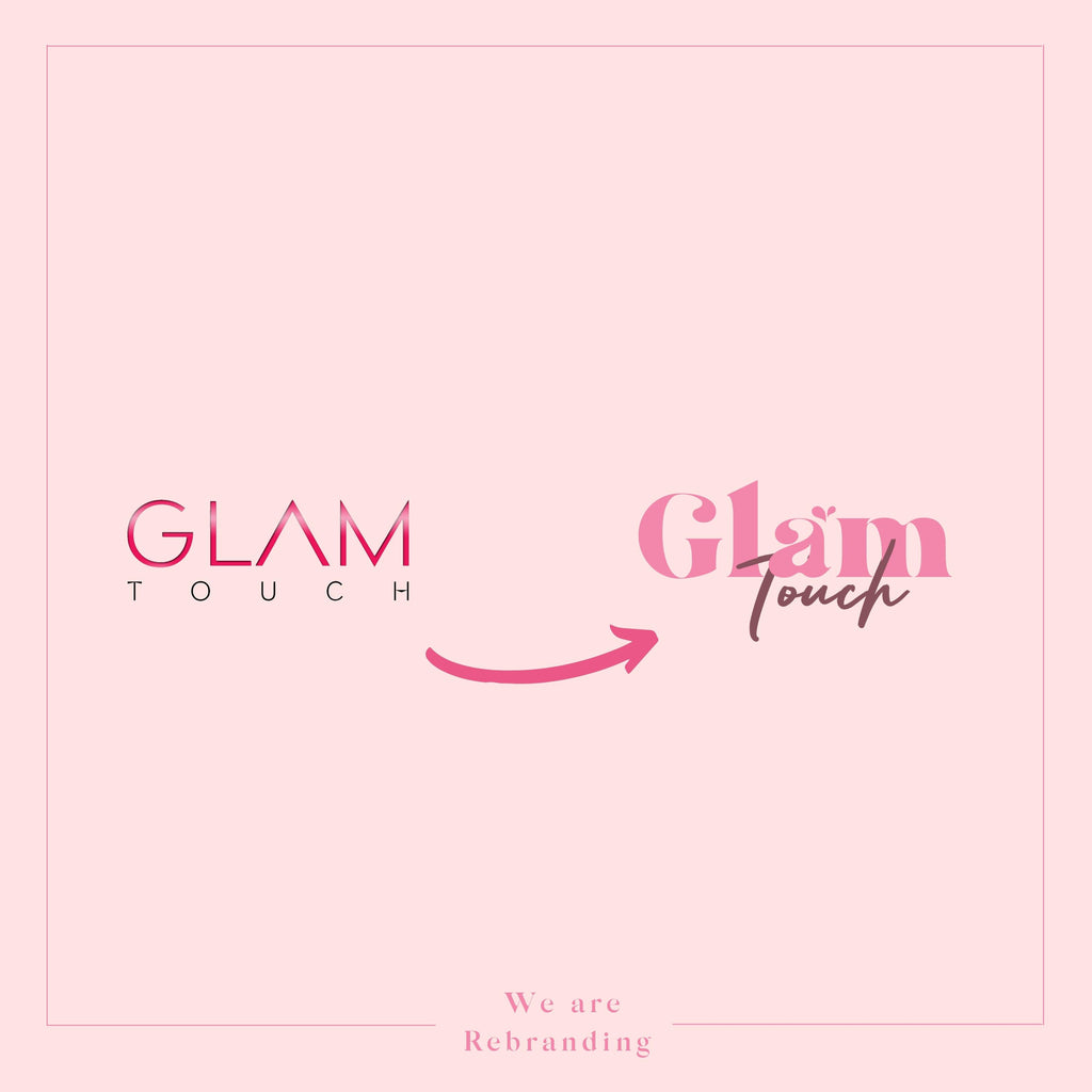
Announcement: We are rebranding with a brand-new logo and colours
Posted by Sen Vu

Big news! We are thrilled to announce that as of November 4, 2021, we are rebranding with a new logo and colour scheme as part of the ongoing evolution of our company’s brand. We’re releasing an updated brand identity, which includes a new definition of our logo and colours.

The updates show the evolution of our company since its founding in 2017. We evolved, we changed, we grew in every possible way as a team, as a company, our core beliefs haven’t changed.
The core message of our company ‘be honest, always be kind and compassionate'.
Over the last few months, we have poured our hearts and souls into creating a new image that would accurately depict who we are, at our core as a team. We are introducing the symbol of heart shaped water drops in our new brand identity. A symbol of growth, evolution and vitality. Two drops of water, a symbol of freshness, bounce to form a heart filled with love.

In the spirit of rebranding, we aim to present ourselves better and provide better services you have experienced, and we’d like to take the opportunity to thank our loyal customers and business partners for your trust and friendship in business.
In the upcoming months our tasks will be to update all our collaterals, uniforms, business cards, etc with the new logo. We realise that changing a logo is a process that can involve many steps and take some time, so we will finalise it gradually.

If you have used the Glam Touch logo in any of your marketing materials, please assist us in updating them. We appreciate your kind support. If you have any questions, please don’t hesitate to contact us at hello@glamtouch.co.uk